
You’ve probably seen the terms CMYK, RGB, or Pantone Matching System (PMS) before, but do you know what they mean? In the past these terms were exclusive to printers and graphic designers, but today websites and online printers have made them accessible to virtually everyone.
Whether in print or on the web, you want your marketing materials and brand to look good. And understanding different color combinations will help you take advantage of the psychology and power of colors. Choosing the right colors will help convey your message, make your project stand out and have the desired effect on your audience.
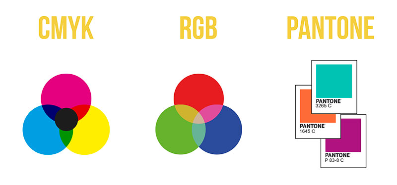
CMYK, RGB, and Pantone are industry standards for color modes. How do they compare and what are their uses? Find out now!
CMYK Color
CMYK color mode uses the colors cyan, magenta, yellow, and black in different amounts to create all the colors of the image to be printed. New colors are created in a subtractive process in which light is removed or absorbed.

With so many different media and technologies, getting the same color everywhere can be quite a challenge. Sometimes conversions such as CMYK to Pantone or CMYK to PMS and CMYK to RGB are necessary to ensure image quality.
Fortunately, in today’s digital world this means you can use tools to make conversions much easier and get the same colors for your projects across all media.
When all colors are mixed, an intense black is produced.
Use of CMYK
CMYK is used for printed materials. CMYK colors do not appear as bright as RGB (they lack the added advantage of a backlit display). Brochures, business cards, posters, etc. can be printed in CMYK.

Pantone Color (PMS)
As a standardized color matching system, Pantone uses a numbering system to quickly and accurately identify color. Pantone color codes allow different manufacturers to reference colors and thus obtain the correct colors without the need for direct comparison.

Pantone was initially designed for the graphics industry, but is now used outside the sector and has become a widely used palette in many different industries.
The Pantone Matching System (PMS) is used to correctly match materials to their corresponding RGB or CMYK colors. This ensures that a color looks the same every time it is produced when compared to a Pantone swatch.
In our blog we have another post that offers a more in-depth explanation about Pantone Color Charts.
Use of PMS
The Pantone Matching System can be used to accurately match colors for everything from fabrics and paints to t-shirts and printed materials.

RGB Color
The RGB color mode combines the primary colors: red, green, and blue in different combinations to create many colors. The RGB color mode offers the widest range of colors and is the color profile used by digital devices and displays. The colors you see on websites, apps, videos, and more on your screen are created using RGB.

RGB colors use light to make colors bright. If you were to mix them all together, you would get pure white.
Use of RGB
RGB is the color profile used for digital devices and displays. Your screen mixes red, green, and blue light to produce bright colors. Websites, mobile applications, video, etc. all of them use RGB.

RGB and CMYK, what’s the difference?
Why is this issue so important for printers?
The answer is quite simple: because a printer cannot process images that are in a mode other than CMYK.
By its own definition, CMYK are the initials of the four basic inks with which we build color in offset printing: cyan, magenta, yellow, and black (the K stands for black). Therefore, in order to be able to “separate” an image into the different plates that will later be put in the offset press, this image must contain information in CMYK mode, because if it is in RGB then it is not processed properly, it is not “digested” by the program that is going to make the plate, so to speak.
When a printer receives an image in color modes other than CMYK, they must convert it to CMYK, they have no choice, and this conversion must be done with the appropriate color profiles, because a “translation” from one mode to another, if not well managed, can end up in an image of poorer quality than the original. We must be clear about this concept.
Nowadays…
Nowadays, generally, image capture is done through digital cameras that apply color modes and profiles in RGB, which is why it usually happens that the designer, layout artist, or illustrator, in their daily work, handle photos and images that will later have to be converted to CMYK. Whether they do it themselves or a pre-press operator (who prepares the job for the printer and makes the plates) does it, we will always have to take this transformation step, and the most correct, in our opinion, is to do it from the beginning, when working with them.
What about printing?
Knowing the differences between color profiles can help you understand how different printing processes work and how those processes will affect a finished project.
Direct Color (OFFSET)
Direct color printing is usually used for jobs that do not require full-color images, such as in the case of business cards and other stationery items, or in monotonous literature (or duotone, etc.), such as printing newspapers in black and white.
Direct color printing describes the process in which a specialized ink or specially mixed ink is created to make a perfect combination that corresponds to the desired color, such as a Pantone sample.
If there is only one color to print, there will be a single plate and a single run of the press. If there are two colors, there will be two plates and two runs, and so on. The colors are layered onto the paper one by one.

Four Colors (OFFSET)
4-color printing refers to the CMYK printing process. This means that your job will be printed using only Cyan, Magenta, Yellow, and Black ink colors.
Just like flat color printing, each color is run one at a time. Layering each ink color produces a final product with a full spectrum of colors.
The 4-color process is the most common form of printing and is best for large batches, such as 500 postcards. It produces clear, sharp prints.
In some cases, it may be possible to do a 6 or 8 color printing. This type of process is more expensive but will produce a wider range of colors.

Digital Printing
Digital printing uses toner or inkjet technology. Digital printing can still use CMYK, but all colors are applied at once instead of with the “offset” roller method.
Although it has been considered in the past as not as “sharp” as offset printing, technologies continue to improve and digital printing can produce great results.
Digital printing is recommended for small batches, such as 20 invitations or a single poster.
Since digital printing does not require the creation of printing plates, the response time is usually much faster.

How to safely convert a photo to CMYK
1 Open the photo in Photoshop.
2 Before doing anything else, you should set the default Workspace of the program. In Photoshop, go to the top menu, to the View – Proof Setup – Custom… concept, and a window will appear where you should choose the Coated FOGRA39 (ISO 12647-2:2004) Workspace.

3 Once we have defined the Color Space of the program according to the image parameters, we can convert the image to CMYK as we do in Photoshop, that is, by going to the Image – Mode – CMYK menu, in the image you can see it:

4 Once converted, save it and you’re done, now you can use this image for offset printing.
Color modes in the color palette
As we have already mentioned, in offset printing, colors in four-color process (CMYK: cyan, magenta, yellow, and black) and also custom Pantone library colors (in their different classes) are used. CMYK colors are printed from 4 different plates, one for each primary tone. Pantone colors are printed with a single plate, for the chosen tone.
When we are laying out or designing in pre-press programs, we must keep in mind that we should only use CMYK or Pantone colors in the color palette, depending on the type of final printing we will perform.
When we use spot colors (Pantones), we should take into account the following:
In any of the programs used for Pre-press, the way to check that there are NO improper colors is to go to the print menu and click on the SEPARATIONS cross, in it we will see all the colors used, verifying at a glance if there are undesired colors, or if the desired ones are missing. This issue must be fixed before sending it to print. If it cannot be fixed, talk to the printer, it may be just an apparent error (the unwanted color may appear in the list of colors used, but not actually be used).
2. Keep an eye on color overprints and notify the printer when they are used, as sometimes they can cover letters or unwanted elements. If we receive a warning, we can make sure that it does indeed come out as the client expects.
3. As a general rule, we do not recommend using pattern fills, as they often cause errors when processed.
More information about color modes: Quality and color in images
Conclusions
Knowing how color palettes work is key to any graphic design project. Here’s an awesome guide to help you decide when to best use RGB, CMYK, and PMS (Pantone).
Our article on Gold Pantone.


